Residents divided over new logo
Published 10:26 am Friday, March 28, 2014
A new logo for Austin has residents talking. Problem is, a lot of that talk isn’t positive.
City leaders and Mayor Tom Stiehm say they’ve heard negative feedback on the “talent packed” logo created to replace several decades-old logos still in use, while other leaders voiced their support for the logo.
Council Member Roger Boughton said he has heard a lot of negative feedback at meetings and places he has visited over the past week.
“If it doesn’t grab us, I don’t think it’s going to grab somebody who doesn’t know about Austin,” he said.
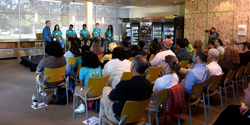
Vision 2020’s Director of Vision Creation Laura Helle voiced her support.![]()
“I feel very proud of it,” Helle said. “I think it’s a great solution for the community.”
The logo hasn’t found much fanfare since its public unveiling last week. Some criticized the logo for its seemingly simplistic design.
“I think it’s pretty generic,” Melody Yabandith said. “‘Talent Packed’ seems a little cliché.’”
Others, like Paul Couvrette, thought the logo was pretty, though Couvrette wasn’t sure what the logo tried to represent for the city of Austin. Others liked the connection between color and substance.
“I think it’s fun,” Nancy Qual said.
A branding committee, a subcommittee under the Vision 2020 community improvement initiative, spent more than a year working on the new logo as part of an updated brand campaign for the city.
The group interviewed residents around town and hired Minneapolis-based Haberman Consulting to discuss how best to represent Austin and to design the logo. The project cost about $60,000, according to Helle. The city of Austin contributed $10,000, Austin’s Convention and Visitor’s Bureau contributed about $10,000, the city Main Street Project put in $3,000 and The Hormel Foundation contributed $35,000.
The last Austin logo was created more than 20 years ago and the city has several logos and phrases, including Austin’s title as “Spamtown USA.”
The committee, along with Haberman Consulting, found one of Austin’s strengths was its diverse array of jobs and workforce.
“Our point of differentiation was, in the community, how people were really talented here,” Helle said.
The branding committee presented the new logo and campaign emphasizing Austin’s innovative side to several groups, including the Austin Convention and Visitors Bureau and the Austin Area Chamber of Commerce.
Thus far, Council Members Janet Anderson and Judy Enright said many people in those organizations reacted positively to the new logo. Chamber officials even suggested the “Talent Packed” portion of the logo. And Helle said the group heard from more than one person how a new logo should be modern and more clean-looking.
“A lot of communities have logos that are more historic-looking,” she said. “People didn’t want to do it that way.”
Enright and Anderson expressed support for the logo at a March 17 meeting.
Others don’t feel the same way. Multiple residents recognized the Spam-like design but worried outsiders wouldn’t get the reference. Several people who hadn’t seen the logo before Thursday thought it looked like a sardine can.
“Unless you live here, you’re not going to know that’s supposed to be a Spam can,” Kabau Heil said.
And some residents worried Austin would be pigeonholed as just the town where Hormel Foods Corp.’s corporate office is located.
“You’re just putting yourself in a box,” Jeb Mauer said.
In addition, a Daily Herald online poll showed an overwhelmingly negative response to the logo.
“Really do NOT like this logo. Please reconsider,” one Herald commenter wrote in response to the logo.
Boughton asked the council at its last meeting to consider a community poll on the logo, something he intends to bring up once again when the council discusses the logo at its April 7 work session.
Stiehm agreed. He’ll likely suggest a poll through the city’s web site at the upcoming meeting as well.
“You have to have people support it,” he said. “If people don’t support it, I think you’d be really hard-pressed to adopt something like that.”
The council will discuss whether to use the logo as its official letterhead at its first April meeting. If the council adopts the logo, it will slowly phase out the city’s tree logo on letters, vehicles and other places as needed.
The Herald poll does not factor into a potential city poll.